Combobox hiding behind footer - modal content not able scroll when overflow =initial/visible
Salesforce Asked by mvk1991 on September 8, 2020
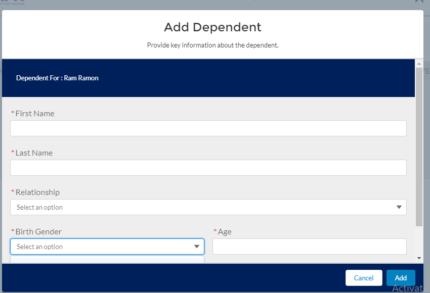
I have a modal with a fixed height, so if the number of fields increase in the modal, scrollbar appears as expected.
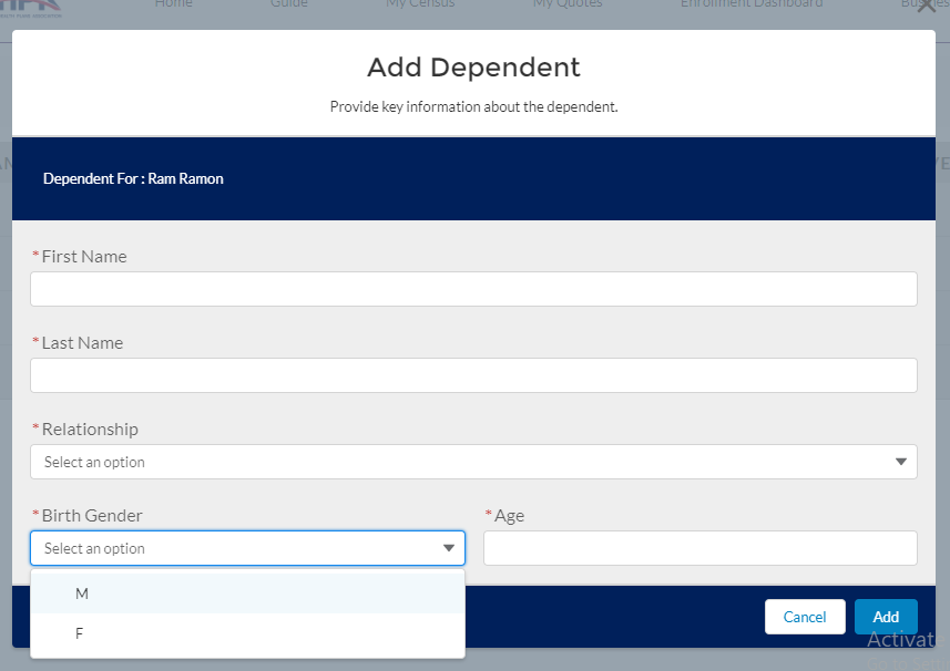
However I have a Combobox at the end of the form which I am not able to view the values, even when I try to click the scrollbar it loses focus.
Solution tried :-
I tried overriding with this css
.THIS .slds-modal__content{
overflow: visible;
}
(Also tried overflow: initial)
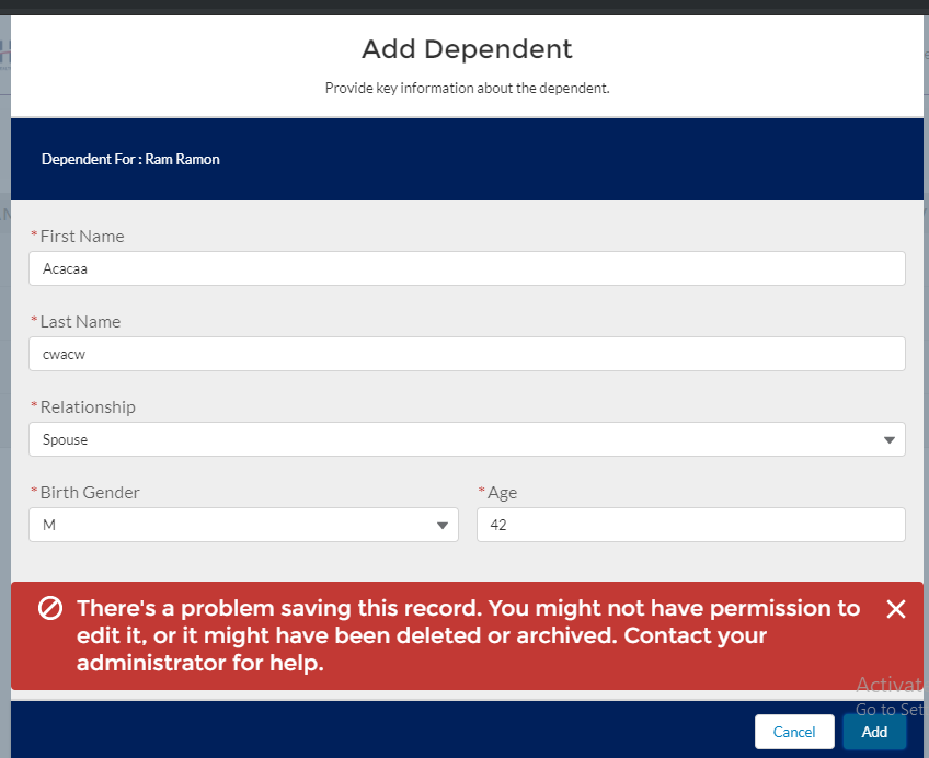
Now the problem gets solved, but it introduces a new problem, that is when an error message comes the modal goes out of the browser window size (Same thing happens when I try to add more fields to the modal) and gets hidden behind the address bar, only visible when we zoom out, the end user may not know this trick though.
Here is some code —
     <div style="height:480px">
    <section role="dialog" tabindex="-1" aria-labelledby="modal-heading-01" aria-modal="true" aria-describedby="modal-content-id-1" class="slds-modal slds-fade-in-open slds-modal_small">
        <div class="slds-modal__container">
            <header class="slds-modal__header">
                <button class="slds-button slds-button_icon slds-modal__close" title="Close" onclick="{!c.closeMainModal}">
                    <lightning:icon iconName="utility:close" alternativeText="Close" size="small" />
                    <span class="slds-assistive-text">{!$Label.c.Select_Plan_Main_Close_Alt_Text}</span>
                </button>
                <h2 id="modal-heading-01" class="slds-text-heading_medium slds-hyphenate">Add Dependent</h2>
                <p class="slds-m-top_x-small">Provide key information about the dependent.</p>
            </header>
            <div class="slds-modal__content slds-theme_default" id="modal-content-id-1">
                <lightning:layout class="slds-p-around_medium slds-p-bottom_x-large slds-theme_inverse" multipleRows="true">
                    <lightning:layoutItem size="12" smallDeviceSize="12" mediumDeviceSize="3" largeDeviceSize="6" padding="around-small">
                        Dependent For : {!v.employee.Name}
                    </lightning:layoutItem>
                </lightning:layout>


                <lightning:layout class="slds-p-around_x-small" multipleRows="true">
                    <!-- Form Start -->
                    <lightning:layoutItem size="12" smalldevicesize="6" mediumdevicesize="6" largedevicesize="6" class="slds-p-around_x-small">
                        <lightning:input label="First Name" value="{!v.depRecord.FirstName}" required="true" type="text" variant="standard"></lightning:input>
                    </lightning:layoutItem>
                    <lightning:layoutItem size="12" smalldevicesize="6" mediumdevicesize="6" largedevicesize="6" class="slds-p-around_x-small">
                        <lightning:input label="Last Name" value="{!v.depRecord.LastName}" required="true" type="text" variant="standard"></lightning:input>
                    </lightning:layoutItem>
                    <lightning:layoutItem size="12" smalldevicesize="6" mediumdevicesize="6" largedevicesize="6" class="slds-p-around_x-small">
                        <lightning:combobox label="Relationship" value="{!v.depRecord.Relationship__c}" options="{!v.relationOptions}" placeholder="Select an option" dropdownAlignment="left" required="true" variant="standard"></lightning:combobox>
                    </lightning:layoutItem>
                    <lightning:layoutItem size="6" smalldevicesize="3" mediumdevicesize="3" largedevicesize="3" class="slds-p-around_x-small">
                        <lightning:combobox label="Birth Gender" value="{!v.depRecord.Gender__c}" options="{!v.genderOptions}" placeholder="Select an option" dropdownAlignment="left" required="true" variant="standard"></lightning:combobox>
                    </lightning:layoutItem>
                    <lightning:layoutItem size="6" smalldevicesize="3" mediumdevicesize="3" largedevicesize="3" class="slds-p-around_x-small">
                        <lightning:input label="Age" value="{!v.depRecord.Age__c}" required="true" type="number" variant="standard"></lightning:input>
                    </lightning:layoutItem>

                    <!-- Form End -->

                </lightning:layout>

            </div>

            <footer class="slds-modal__footer slds-theme_shade">
                <lightning:button variant="neutral" label="{!$Label.c.Select_Plan_Cancel}" title="Cancel" onclick="{!c.closeMainModal}"/>
                <lightning:button variant="brand" label="Add" title="Add" onclick="{!c.createNewDependent}" type="Submit" />
            </footer>
        </div>
    </section>

    <div class="slds-backdrop slds-backdrop_open"></div>

</div>
Can anyone please help me out of this?
3 Answers
@gs650x
Sorry I don't have 50 reputation to comment directly to you.
you can add a <div> element outside your <lightning-combobox>, and give this div element a overflow:visible style.
FYI, my sample code is here:
<div style="overflow: visible">
    <lightning-combobox
      options={typeOptions}
      onchange={handleChange}
      required>
    </lightning-combobox>
</div>
hope this'll help you.
Answered by Lanjinest on September 8, 2020
I've had the same problem with the combo-box and saw this solution for aura component:
https://salesforce.stackexchange.com/a/231486/30302
The only thing to change from the original solution is to remove the .THIS part from the css and then it'll work perfectly.
Your css should look like this (inside the .css file):
.slds-modal__content{
    overflow: initial;
}
Answered by Yonathan Goriachnick on September 8, 2020
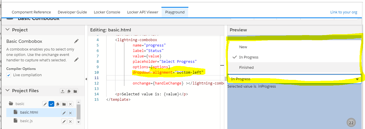
I think you can leverage 'dropdownAlignment="bottom-left" ' attribute of the lightning Combobox like this:
dropdownAlignment="bottom-left"
dropdownAlignment: Specifies where the drop-down list is aligned with or anchored to the selection field. By default the list is aligned with the selection field at the top left so the list opens down. Use bottom-left to make the selection field display at the bottom so the list opens above it. Use auto to let the component determine where to open the list based on space available.
According to salesforce component library documentation, this should work.
See the below screenshot lightning:combobox view as Lightning Web Component in the SF playground
https://developer.salesforce.com/docs/component-library/bundle/lightning:combobox/specification
Answered by Nishad kallingal on September 8, 2020
Add your own answers!
Ask a Question
Get help from others!
Recent Answers
- haakon.io on Why fry rice before boiling?
- Joshua Engel on Why fry rice before boiling?
- Lex on Does Google Analytics track 404 page responses as valid page views?
- Jon Church on Why fry rice before boiling?
- Peter Machado on Why fry rice before boiling?
Recent Questions
- How can I transform graph image into a tikzpicture LaTeX code?
- How Do I Get The Ifruit App Off Of Gta 5 / Grand Theft Auto 5
- Iv’e designed a space elevator using a series of lasers. do you know anybody i could submit the designs too that could manufacture the concept and put it to use
- Need help finding a book. Female OP protagonist, magic
- Why is the WWF pending games (“Your turn”) area replaced w/ a column of “Bonus & Reward”gift boxes?