Hexagon grid with border and image responsive (clip path probably)
Stack Overflow Asked on December 22, 2021
I already asked a similar question but it seems my code is not correct.
I used border in pixels and it is not responsive. I used bootsrtrap to make it responsive but then the hexagons are not as a grid (everyone next to the other)
Here is an image what should be done.

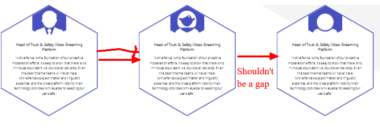
This is how it looks now
Here is my code, which probably is not the right one to allow me to achieve the image above. My hexagons are not as a grid (close to each others), are not scalable and are not responsive.
.hexagon {
  position: relative;
  width: 200px;
  height: 115.47px;
  background-color: #ffffff;
  margin: 57.74px 0;
  border-left: solid 2px #4850be;
  border-right: solid 2px #4850be;
}

.hexagon:before,
.hexagon:after {
  content: "";
  position: absolute;
  z-index: 1;
  width: 141.42px;
  height: 141.42px;
  -webkit-transform: scaleY(0.5774) rotate(-45deg);
  -ms-transform: scaleY(0.5774) rotate(-45deg);
  transform: scaleY(0.5774) rotate(-45deg);
  background-color: inherit;
  left: 27.2893px;
  z-index:1;
}

.hexagon:before {
  top: -70.7107px;
  border-top: solid 2.8284px #4850be;
  border-right: solid 2.8284px #4850be;
}

.hexagon:after {
  bottom: -70.7107px;
  border-bottom: solid 2.8284px #4850be;
  border-left: solid 2.8284px #4850be;
}

/* NEW */
.icon-box{
  width: 70px;
  height: 30px;
  background-color: #4850be;
  position: absolute;
  top:-35px;
  left: 0;
  right: 0;
  margin: auto;
  z-index: 10;
}

.icon-box:before,
.icon-box:after{
  content: "";
  position: absolute;
  z-index: 1;
  width: 50px;
  height: 50px;
  -webkit-transform: scaleY(0.5774) rotate(-45deg);
  -ms-transform: scaleY(0.5774) rotate(-45deg);
  transform: scaleY(0.5774) rotate(-45deg);
  background-color: inherit;
  left: 0;
  right: 0;
  margin: auto;
  background-color: #4850be;
  z-index:1;
}

.icon-box:before {
  top: -25px;
}

.icon-box:after {
  bottom: -25px;
}

.icon-box i,
.icon-box img
 {
  position: absolute;
  left: 0;
  right: 0;
  bottom: -20px;
  margin: 0 auto;
  z-index: 20;
  font-size: 80px;
  width: 60px;
  height: 60px;
  text-align: center;
  color: #fff;
}

.text {
  z-index: 10;
  position: relative;
  font-size: 7px;
  text-align: center;
  padding: 20px;
}

.text h3 {
  font-size: 8px;
}
<link rel="stylesheet" href="https://stackpath.bootstrapcdn.com/bootstrap/4.5.0/css/bootstrap.min.css" integrity="sha384-9aIt2nRpC12Uk9gS9baDl411NQApFmC26EwAOH8WgZl5MYYxFfc+NcPb1dKGj7Sk" crossorigin="anonymous">
<link rel="stylesheet" href="https://cdnjs.cloudflare.com/ajax/libs/font-awesome/4.7.0/css/font-awesome.min.css">
<section id="content">
<div class="container">
<div class="row">
<div class="col-3 col-6-medium col-12-small">
<div class="hexagon">
<div class="icon-box"><img src="images/section/section_2_icon_man.png" alt="" ></div>
<div class="text">
<h3>Head of Trust & Safety,Video Streaming Platform</h3>
<p>"ActiveFence is the foundation of our proactive moderation efforts. It's easy to show that there is no in-house equivalent we could ever develop. Even the best internal teams will never have ActiveFence's subject matter and linguistic expertise, and the cross platform visibility their technology provides is invaluable to keeping our users safe." </p>
</div>
</div>
</div>
<div class="col-3 col-6-medium col-12-small">
<div class="hexagon">
<div class="icon-box"><img src="images/section/section_2_icon_woman.png" alt="" ></div>
<div class="text">
<h3>Head of Trust & Safety,Video Streaming Platform</h3>
<p>"ActiveFence is the foundation of our proactive moderation efforts. It's easy to show that there is no in-house equivalent we could ever develop. Even the best internal teams will never have ActiveFence's subject matter and linguistic expertise, and the cross platform visibility their technology provides is invaluable to keeping our users safe." </p>
</div>
</div>
</div>
<div class="col-3 col-6-medium col-12-small">
<div class="hexagon">
<div class="icon-box"><i class="fa fa-user"></i></div>
<div class="text">
<h3>Head of Trust & Safety,Video Streaming Platform</h3>
<p>"ActiveFence is the foundation of our proactive moderation efforts. It's easy to show that there is no in-house equivalent we could ever develop. Even the best internal teams will never have ActiveFence's subject matter and linguistic expertise, and the cross platform visibility their technology provides is invaluable to keeping our users safe." </p>
</div>
</div>
</div>
</div>
</div>
</section>2 Answers
I managed to sort it out. Here is my different way:
#content-middle {
            position: relative;
            width: 100%;
            min-height: 100vh;
            margin: 0 auto;
            overflow: hidden;
        }

        #content-middle::before {
            top: 0;
            height: 100%;
            background: #f4f4f6;
            -webkit-clip-path: polygon(0 46%, 0% 100%, 54% 100%);
            clip-path: polygon(0 46%, 0% 100%, 54% 100%);
            z-index: -1;
        }

        #content-middle::before, #content::after {
            content: "";
            position: absolute;
            left: 0;
            width: 100%;
        }

        .hexWrapper {
            text-align: center;
            margin: 0px;
            position: relative;
            display: inline-block;
            width: 150px; /*Change this to resize*/
            height: 150px; /*Change this to resize*/
            min-width: 150px;
            min-height: 150px;
            float:left;
        }

        .hexagon {
            height: calc(100%/1.732050807);
            width: 100%;
            background-color: #ffffff;
            display:inline-block;
        }

        .hexagon:before,
        .hexagon:after {
            content: "";
            position: absolute;
            background-color: inherit;
            height: inherit;
            width: inherit;
            left: -1px; right: -1px; top: 0; bottom: 0;
        }

        .hexagon:before {
            transform: rotateZ(60deg);
        }

        .hexagon:after {
            transform: rotateZ(120deg);
        }

        .hexagon,
        .hexagon:before,
        .hexagon:after {
            box-sizing: content-box;
            border: solid 2px #4850be;
            border-top-width: 0;
            border-bottom-width: 0;
            z-index: -1; /*We need to force the z-index so we can put some text over*/
        }

        #container{
            padding-top: 60px;
            width:100%;
            min-width:910px; /* so the page doesn't get too small. This should be done better with media queries*/
        }

        .row-hexagon{
            clear:both; /*to reset all the configs*/
            float:left;
            display: flex; /* using some flex to aline to center */
            justify-content: center;
            overflow:hidden; /*this is for after, when we add more hex's*/
            padding-top:145px; /* To take care of the top part of the hex, needs changing if we change the size on the wrapper*/
            position:relative;
        }

        .fullWidth{
            width: 100%;
        }


        .icon-box{
            width: 75px;
            height:40px;
            background-color: #4850be;
            position: absolute;
            top:-25px;
            left: 0;
            right: 0;
            margin: auto;
            z-index: 10;
        }

        .icon-box:before,
        .icon-box:after{
            content: "";
            position: absolute;
            z-index: 1;
            width: 50px;
            height: 50px;
            -webkit-transform: scaleY(0.5774) rotate(-45deg);
            -ms-transform: scaleY(0.5774) rotate(-45deg);
            transform: scaleY(0.5774) rotate(-45deg);
            background-color: inherit;
            left: 0;
            right: 0;
            margin: auto;
            background-color: #4850be;
            z-index:1;
        }

        .icon-box:before {
            top: -25px;
        }

        .icon-box:after {
            bottom: -25px;
        }

        .icon-box i,
        .icon-box img {
            position: absolute;
            left: 0;
            right: 0;
            bottom: -20px;
            margin: 0 auto;
            z-index: 20;
            font-size: 90px;
            width: 80px;
            height: 80px;
            text-align: center;
            color: #fff;
        }

        .text {
            z-index: 10;
            position: relative;
            font-size: 17px;
            text-align: center;
            padding: 20px;
        }

        .text h3 {
            font-size: 1em;
            color:#42c9c0;
            font-weight:700;
        }

        .text h4{
            font-size: 0.8em;
            color:#42c9c0;
            font-weight:300;
        }

        .text p{
            font-size: 0.5em;
            font-weight:300;
            font-style:italic;
        }
<!-- <!-- FonT Awesome for demo purposes here --> -->
<link rel="stylesheet" href="https://cdnjs.cloudflare.com/ajax/libs/font-awesome/4.7.0/css/font-awesome.min.css">
<section id="content-middle">
<div id="container-hexagon">
<div class="row-hexagon fullWidth" id="firstRow">
<div class="hexWrapper">
<div class="hexagon">
<div class="icon-box"><i class="fa fa-user"></i></div>
<div class="text">
<h3>Title</h3>
<h4>Subtitle </h4>
<p>Text</p>
</div>
</div>
</div>
<div class="hexWrapper">
<div class="hexagon">
<div class="icon-box"><i class="fa fa-user"></i></div>
<div class="text">
<h3>Title</h3>
<h4>Subtitle </h4>
<p>Text</p>
</div>
</div>
</div>
<div class="hexWrapper">
<div class="hexagon">
<div class="icon-box"><i class="fa fa-user"></i></div>
<div class="text">
<h3>Title</h3>
<h4>Subtitle </h4>
<p>Text</p>
</div>
</div>
</div>
</div>
</div>
</div>
</section>Answered by Jenny on December 22, 2021
Your webpage/website is not responsive because you used px, to make it responsive use Viewport Units like vw for width and vh for height instead of px and % to make your webpage/website responsive. (Note:- 1vw=0.5cm)
It will surely work but if it doesn't let me know in the comments, I will try my best to help you.
Answered by shubh1834 on December 22, 2021
Add your own answers!
Ask a Question
Get help from others!
Recent Questions
- How can I transform graph image into a tikzpicture LaTeX code?
- How Do I Get The Ifruit App Off Of Gta 5 / Grand Theft Auto 5
- Iv’e designed a space elevator using a series of lasers. do you know anybody i could submit the designs too that could manufacture the concept and put it to use
- Need help finding a book. Female OP protagonist, magic
- Why is the WWF pending games (“Your turn”) area replaced w/ a column of “Bonus & Reward”gift boxes?
Recent Answers
- Joshua Engel on Why fry rice before boiling?
- Jon Church on Why fry rice before boiling?
- Peter Machado on Why fry rice before boiling?
- Lex on Does Google Analytics track 404 page responses as valid page views?
- haakon.io on Why fry rice before boiling?