how to make dialog like google keep in pure js and css
Stack Overflow Asked by user8987378 on December 16, 2020
how can i create dialog effect like google keep.i tried to debug the css but without any success.
is there code example out there ?
i see that they using hidden position fixed modal that triggering on click but how they calculate the position.

3 Answers
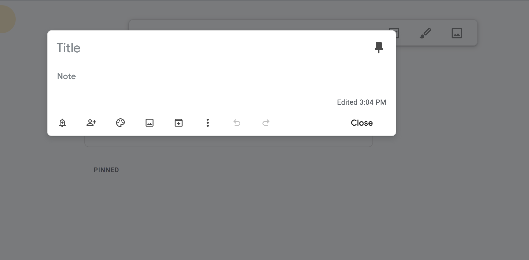
To create a modal, you can use a library called Swal. Swal, however does not look like keep's popups, so I've restyled it below.
script links you must reference to:
<link rel="stylesheet" href="https://cdn.jsdelivr.net/npm/@sweetalert2/theme-material-ui/material-ui.css">
<link rel="stylesheet" href="https://cdnjs.cloudflare.com/ajax/libs/animate.css/4.1.1/animate.min.css"/>
<script src="https://cdn.jsdelivr.net/npm/sweetalert2@10"></script>.
You may also wish to visit Google Fonts and pick a nice font-family. Test this pop-up by clicking run this snippet.
const MySwal = Swal.mixin({
    //background: "rgb(10,10,10)",
    background: "white",
    showCloseButton: true,
    backdrop: "rgba(0,0,0,0.7)",


    showClass: {
        popup: "animate__animated animate__fadeInDown med"
    },

    hideClass: {
        popup: "animate__animated animate__fadeOutUp fast"
    },

    width: "95vw"

});
<head>
<script src="https://cdnjs.cloudflare.com/ajax/libs/lodash.js/4.17.20/lodash.js" integrity="sha512-HBD0cOZJYcymSn0H0CnN3VBhQLdiH8imucm16ZQ792TT2n48u6nmX+T7hZTCwmzIrgMt76x4rHhR7KkZqhIGxA==" crossorigin="anonymous"></script>
<script src="https://ajax.googleapis.com/ajax/libs/jquery/3.5.1/jquery.min.js"></script>
<meta charset="UTF-8">
<script src="https://cdn.jsdelivr.net/npm/sweetalert2@10"></script>
<script src="alpha.js"></script>
<link rel="stylesheet" href="https://cdnjs.cloudflare.com/ajax/libs/animate.css/4.1.1/animate.min.css"/>
<link rel="shortcut icon" href="favicon.png" id="iconshort">
<link rel="stylesheet" href="https://cdn.jsdelivr.net/npm/@sweetalert2/theme-material-ui/material-ui.css">
<script src='https://kit.fontawesome.com/a076d05399.js'></script>
<link href="https://fonts.googleapis.com/css2?family=Roboto:wght@300&display=swap" rel="stylesheet">
</head>
<body>
<button onclick="MySwal.fire('Title','Content')">LAUNCH POP-UP</button>
</body>const MySwal = Swal.mixin({
//background: "rgb(10,10,10)",
background: "white",
showCloseButton: true,
backdrop: "rgba(0,0,0,0.7)",
showClass: {
popup: "animate__animated animate__fadeInDown med"
},
hideClass: {
popup: "animate__animated animate__fadeOutUp fast"
},
width: "95vw",
willOpen: function() {
open_audio.play();
},
willClose: function() {
confirm_audio.play();
}
});
Correct answer by AlphaHowl on December 16, 2020
This is what i could make out of your question(pure JS and CSS).
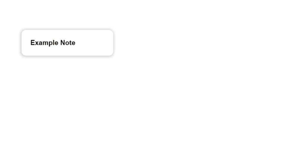
Below is the code
var example_note = document.getElementsByClassName('example_note')[0];
var close_btn = document.getElementById('close_btn');
example_note.onclick = function() {
  document.getElementsByClassName('background_change')[0].style.display = "block";
  document.getElementsByClassName('display_block')[0].style.display = "block";
  example_note.style.display="none";
}

close_btn.onclick = function() {
  document.getElementsByClassName('background_change')[0].style.display = "none";
  document.getElementsByClassName('display_block')[0].style.display = "none";
  example_note.style.display="block";
}
* {
margin: 0px;
padding: 0px;
font-family: 'arial';
}
.example_note {
position: absolute;
width: 250px;
margin-top: 10%;
margin-left: 15%;
box-shadow: -1px 1px 10px 3px rgba(0, 0, 0, 0.2);
-webkit-box-shadow: -1px 1px 10px 3px rgba(0, 0, 0, 0.2);
-moz-box-shadow: -1px 1px 10px 3px rgba(0, 0, 0, 0.2);
padding: 30px;
border-radius: 15px;
background-color: white;
}
.example_note h1 {
font-size: 23px;
}
.display_block {
display: none;
position: absolute;
top: 50%;
left: 50%;
transform: translate(-50%, -50%);
width: 450px;
background-color: white;
padding: 30px;
border-radius: 15px;
transform-origin: 0 25%;
animation: show_block 0.2s 1;
}
@keyframes show_block {
from {
transform: translate(-50%, -50%)scale(0);
}
to {
transform: translate(-50%, -50%)scale(1);
}
}
input[type="text"] {
width: 390px;
padding: 10px;
border: none;
}
input[type="text"]:focus {
outline: none;
}
button {
float: right;
background-color: white;
padding: 10px 20px 10px 20px;
border-radius: 8px;
border: none;
font-size: 17px;
transition: 0.4s;
font-weight: bold;
outline: none;
}
button:hover {
background-color: #E3E3E3;
}
.background_change {
display: none;
height: 100%;
width: 100%;
position: absolute;
background-color: black;
opacity: 0.6;
animation: show_back 0.5s 1;
}
@keyframes show_back {
from {
opacity: 0;
}
to {
opacity: 0.6;
}
}<div class="example_note">
<h1>Example Note</h1>
</div>
<div class="background_change"></div>
<div class="display_block">
<input type="text" name="title" placeholder="Title" style="font-size: 25px;">
<br>
<input type="text" name="name" value="Example Note" style="font-size: 15px; font-weight: bold;">
<br>
<button id="close_btn">close</button>
</div>Answered by Ac_mmi on December 16, 2020
This answer is plain JavaScript and CSS (no libraries), and produces the following effect:
A full working example is contained in the following snippet (best previewed full screen):
function openModal(noteEl, modalEl, modalContainerEl) {

        // Compute and apply the transform to deform the modal to cover the note with a transition to make it animate
        const transform = computeTransform(noteEl);
        modalEl.style.transform = transform;
        modalEl.style.transition = 'transform 250ms';

        // Setup the modal background animate in too
        modalContainerEl.style.backgroundColor = 'transparent';
        modalContainerEl.style.transition = 'background-color 250ms';

        // Show the modal
        modalContainerEl.classList.add('modal-container--open');

        // Put the rest in a setTimeout to allow the styles applied above to take
        // affect and render before we overwrite them with new ones below
        setTimeout(function () {
          // Remove the transform to allow the modal to return to it's natural shape and position
          modalEl.style.transform = 'none';
          modalContainerEl.style.backgroundColor = 'rgba(33, 33, 33, 0.5)';
        }, 0)
      }

      function computeTransform(noteEl) {

        // Modal positions here are hardcoded to match styles set in CSS
        const modalTop = 150;
        const modalLeft = (document.body.offsetWidth / 2) - 300;
        const modalWidth = 600;
        const modalHeight = 150;

        // Get note div's position relative to the viewport
        const notePosition = noteEl.getBoundingClientRect();

        // Compute a CSS transform that moves the modal to match the note's position
        const translateX = notePosition.left - modalLeft;
        const translateY = notePosition.top - modalTop;
        const scaleX = notePosition.width / modalWidth;
        const scaleY = notePosition.height / modalHeight;

        return `translateX(${translateX}px) translateY(${translateY}px) scaleX(${scaleX}) scaleY(${scaleY})`;
      }

      // Handle click events using event delegation
      document.addEventListener('click', function (event) {

        // Handle click events on note elements (open modal)
        if (event.target.className === 'note') {

          // Get a reference
          const modalContainerEl = document.querySelector('.modal-container');
          const modalEl = document.querySelector('.modal');
          openModal(event.target, modalEl, modalContainerEl);
        }

        // Handle click event on modal background element (close modal)
        if (event.target.classList.contains('modal-container')) {
          event.target.classList.remove('modal-container--open');
        }
      })
body {
display: flex;
flex-wrap: wrap;
width: 100%;
color: #333;
}
.note {
flex: 0 0 200px;
width: 200px;
height: 200px;
border: 1px solid #CCC;
margin: 12px;
border-radius: 10px;
}
.modal-container {
display: none;
position: fixed;
top: 0;
left: 0;
bottom: 0;
right: 0;
background-color: rgba(33, 33, 33, 0.5);
}
.modal-container--open {
display: block;
}
.modal {
position: absolute;
top: 150px;
left: 50%;
margin-left: -300px;
width: 600px;
height: 150px;
transform-origin: top left;
will-change: transform; /* makes the animation run smoother */
background-color: #EEE;
border-radius: 10px;
}<!DOCTYPE html>
<html>
<head>
<style type="text/css" />
</style>
<script type="text/javascript">
</script>
</head>
<body>
<div class="note">1</div>
<div class="note">2</div>
<div class="note">3</div>
<div class="note">4</div>
<div class="note">5</div>
<div class="note">6</div>
<div class="note">7</div>
<div class="note">8</div>
<div class="note">9</div>
<div class="note">10</div>
<div class="note">11</div>
<div class="note">12</div>
<div class="note">13</div>
<div class="note">14</div>
<div class="note">15</div>
<div class="note">16</div>
<div class="note">17</div>
<div class="note">18</div>
<div class="note">19</div>
<div class="note">20</div>
<div class="modal-container">
<div class="modal">
Modal
</div>
</div>
</body>
</html>The trick is to apply a CSS transform to the modal in order to deform into the shape/position of the clicked note before showing the modal. We can then remove the transform and use a CSS transition to get it to smoothly animate into it's natural shape/position.
We calculate the transform as follows:
function computeTransform(noteEl) {

  // Modal positions here are hardcoded to match styles set in CSS
  const modalTop = 150;
  const modalLeft = (document.body.offsetWidth / 2) - 300;
  const modalWidth = 600;
  const modalHeight = 150;

  // Get note div's position relative to the viewport
  const notePosition = noteEl.getBoundingClientRect();

  // Compute a CSS transform that moves the modal to match the note's position
  const translateX = notePosition.left - modalLeft;
  const translateY = notePosition.top - modalTop;
  const scaleX = notePosition.width / modalWidth;
  const scaleY = notePosition.height / modalHeight;

  return `translateX(${translateX}px) translateY(${translateY}px) scaleX(${scaleX}) scaleY(${scaleY})`;
}
And we apply it as follows:
function openModal(noteEl, modalEl, modalContainerEl) {

  // Compute and apply the transform to deform the modal to cover the note with a transition to make it animate
  const transform = computeTransform(noteEl);
  modalEl.style.transform = transform;
  modalEl.style.transition = 'transform 250ms';

  // Setup the modal background animate in too
  modalContainerEl.style.backgroundColor = 'transparent';
  modalContainerEl.style.transition = 'background-color 250ms';

  // Show the modal
  modalContainerEl.classList.add('modal-container--open');

  // Put the rest in a setTimeout to allow the styles applied above to take
  // affect and render before we overwrite them with new ones below
  setTimeout(function () {
    // Remove the transform to allow the modal to return to it's natural shape and position
    modalEl.style.transform = 'none';
    modalContainerEl.style.backgroundColor = 'rgba(33, 33, 33, 0.5)';
  }, 0)
}
Note the setTimeout between applying and removing the transform. This is important as otherwise the transform will never actually be applied.
See the snippet for the full details, but also of note: the transform-origin: top left; style on the modal is important to make the transform computation work.
Answered by Nico Burns on December 16, 2020
Add your own answers!
Ask a Question
Get help from others!
Recent Answers
- Lex on Does Google Analytics track 404 page responses as valid page views?
- Peter Machado on Why fry rice before boiling?
- Joshua Engel on Why fry rice before boiling?
- Jon Church on Why fry rice before boiling?
- haakon.io on Why fry rice before boiling?
Recent Questions
- How can I transform graph image into a tikzpicture LaTeX code?
- How Do I Get The Ifruit App Off Of Gta 5 / Grand Theft Auto 5
- Iv’e designed a space elevator using a series of lasers. do you know anybody i could submit the designs too that could manufacture the concept and put it to use
- Need help finding a book. Female OP protagonist, magic
- Why is the WWF pending games (“Your turn”) area replaced w/ a column of “Bonus & Reward”gift boxes?