TextInputLayout with loading indicator
Stack Overflow Asked by Antimonit on December 30, 2021
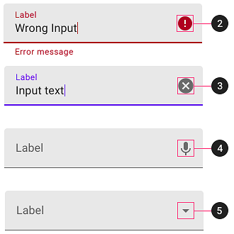
Using TextInputLayout from Material Design library we can use various end icon modes for password redaction, text clearing and custom mode. Furthermore, if we use any of Widget.MaterialComponents.TextInputLayout.*.ExposedDropdownMenu styles it will automatically apply special end icon mode that displays open and close chevrons.
Example of various icon modes:
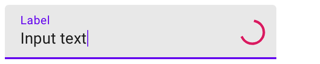
Given the variety of use cases for the end icon, we decided to use a loading indicator in the InputTextLayout so that it looks like this:
How should one proceed to implement it?
3 Answers
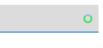
This question already has a good answer, however, I would like to post a more concise and simpler solution. If you use androidx you have a class that inherits Drawable - CircularProgressDrawable, so you can use it. This some piece of code I use in my project:
CircularProgressDrawable drawable = new CircularProgressDrawable(requireContext());
        drawable.setStyle(CircularProgressDrawable.DEFAULT);
        drawable.setColorSchemeColors(Color.GREEN);
 inputLayout.setEndIconOnClickListener(view -> {
            inputLayout.setEndIconDrawable(drawable);
            drawable.start();
//some long running operation starts...
}
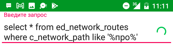
Result:
Answered by Alex Rmcf on December 30, 2021
You can use the ProgressIndicator provided by the Material Components Library.
In your layout just use:
    <com.google.android.material.textfield.TextInputLayout
        android:id="@+id/textinputlayout"
        ...>

        <com.google.android.material.textfield.TextInputEditText
          .../>

    </com.google.android.material.textfield.TextInputLayout>
Then define the ProgressIndicator using:
    ProgressIndicatorSpec progressIndicatorSpec = new ProgressIndicatorSpec();
    progressIndicatorSpec.loadFromAttributes(
            this,
            null,
            R.style.Widget_MaterialComponents_ProgressIndicator_Circular_Indeterminate);

    progressIndicatorSpec.circularInset = 0; // Inset
    progressIndicatorSpec.circularRadius =
            (int) dpToPx(this, 10); // Circular radius is 10 dp.

    IndeterminateDrawable progressIndicatorDrawable =
            new IndeterminateDrawable(
                    this,
                    progressIndicatorSpec,
                    new CircularDrawingDelegate(),
                    new CircularIndeterminateAnimatorDelegate());
Finally apply the drawable to the TextInputLayout:
 textInputLayout.setEndIconMode(TextInputLayout.END_ICON_CUSTOM);
 textInputLayout.setEndIconDrawable(progressIndicatorDrawable);
It is the util method to convert to dp:
public static float dpToPx(@NonNull Context context, @Dimension(unit = Dimension.DP) int dp) {
    Resources r = context.getResources();
    return TypedValue.applyDimension(TypedValue.COMPLEX_UNIT_DIP, dp, r.getDisplayMetrics());
}
You can easily customize the circularRadius and the indicatorColors and all other attributes defined in the ProgressIndicator:
    progressIndicatorSpec.indicatorColors = getResources().getIntArray(R.array.progress_colors);
    progressIndicatorSpec.growMode = GROW_MODE_OUTGOING;
with this array:
<integer-array name="progress_colors">
    <item>@color/...</item>
    <item>@color/....</item>
    <item>@color/....</item>
</integer-array>
Note: it requires at least the version 1.3.0-alpha02.
Answered by Gabriele Mariotti on December 30, 2021
One can simply set use custom drawable in place of End Icon like this:
textInputLayout.endIconMode = TextInputLayout.END_ICON_CUSTOM
textInputLayout.endIconDrawable = progressDrawable
The problematic part is getting hold of a loading indicator drawable.
Bad Option 1
There is no public drawable resource we can use for a loading indicator.
There is android.R.drawable.progress_medium_material but it is marked private and cannot be resolved in code. Copying the resource and all of its dependent private resources totals into about 6 files (2 drawables + 2 animators + 2 interpolators). That could work but feels quite like a hack.
Bad Option 2
We can use ProgressBar to retrieve its indeterminateDrawable. The problem with this approach is that the drawable is closely tied to the ProgressBar. The indicator is animated only when the ProgressBar is visible, tinting one View will also tint the indicator in the other View and probably additional weird behavior.
In similar situations, we can use Drawable.mutate() to get a new copy of the drawable. Unfortunately the indeterminateDrawable is already mutated and thus mutate() does nothing.
What actually worked to decouple the drawable from the ProgressBar was a call to indeterminateDrawable.constantState.newDrawable(). See documentation for more insight.
Anyway, this still feels like a hack.
Good Option 3
Although the drawable resource is marked private we can resolve certain theme attributes to get the system's default loading indicator drawable. The theme defines progressBarStyle attribute that references style for ProgressBar. Inside of this style is indeterminateDrawable attribute that references themed drawable. In code we can resolve the drawable like this:
fun Context.getProgressBarDrawable(): Drawable {
    val value = TypedValue()
    theme.resolveAttribute(android.R.attr.progressBarStyleSmall, value, false)
    val progressBarStyle = value.data
    val attributes = intArrayOf(android.R.attr.indeterminateDrawable)
    val array = obtainStyledAttributes(progressBarStyle, attributes)
    val drawable = array.getDrawableOrThrow(0)
    array.recycle()
    return drawable
}
Great, now we have a native loading indicator drawable without hacks!
Extra measures
Animation
Now if you plug in the drawable into this code
textInputLayout.endIconMode = TextInputLayout.END_ICON_CUSTOM
textInputLayout.endIconDrawable = progressDrawable
you will find out that it does not display anything.
Actually, it does display the drawable correctly but the real problem is that it is not being animated. It just happens that at the beginning of the animation the drawable is collapsed into an invisible point.
Unfortunately for us, we cannot convert the drawable to its real type AnimationScaleListDrawable because it is in com.android.internal.graphics.drawable package.
Fortunately for us, we can type it as Animatable and start() it:
(drawable as? Animatable)?.start()
Colors
Another unexpected behavior happens when TextInputLayout receives/loses focus. At such moments it will tint the drawable according to colors defined by layout.setEndIconTintList(). If you don't explicitly specify a tint list, it will tint the drawable to ?colorPrimary. But at the moment when we set the drawable, it is still tinted to ?colorAccent and at a seemingly random moment it will change color.
For that reason I recommend to tint both layout.endIconTintList and drawable.tintList with the same ColorStateList. Such as:
fun Context.fetchPrimaryColor(): Int {
    val array = obtainStyledAttributes(intArrayOf(android.R.attr.colorPrimary))
    val color = array.getColorOrThrow(0)
    array.recycle()
    return color
}

...

val states = ColorStateList(arrayOf(intArrayOf()), intArrayOf(fetchPrimaryColor()))
layout.setEndIconTintList(states)
drawable.setTintList(states)
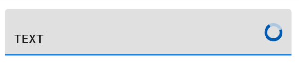
Ultimately we get something like this:
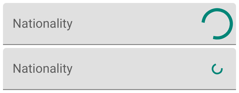
with android.R.attr.progressBarStyle (medium) and android.R.attr.progressBarStyleSmall respectively.
Answered by Antimonit on December 30, 2021
Add your own answers!
Ask a Question
Get help from others!
Recent Questions
- How can I transform graph image into a tikzpicture LaTeX code?
- How Do I Get The Ifruit App Off Of Gta 5 / Grand Theft Auto 5
- Iv’e designed a space elevator using a series of lasers. do you know anybody i could submit the designs too that could manufacture the concept and put it to use
- Need help finding a book. Female OP protagonist, magic
- Why is the WWF pending games (“Your turn”) area replaced w/ a column of “Bonus & Reward”gift boxes?
Recent Answers
- Lex on Does Google Analytics track 404 page responses as valid page views?
- Joshua Engel on Why fry rice before boiling?
- haakon.io on Why fry rice before boiling?
- Peter Machado on Why fry rice before boiling?
- Jon Church on Why fry rice before boiling?